Since 2015, I have been writing this blog and never even think hard about writing posts in dept about the bond market or debt markets and so it was not a big shock for me when I realize that I didn’t write anything about the yield curve. I was tracking it for quite some time and there was some talk about it.
But as I was going through the news, found that the yield curve inverted. While reading about it, found that it was inverted in December 2019. before covid hit global markets. and I am not at all shocked. The yield curve predicted all recessions for the last 50 years. How does this happen? the reason is simple. The debt market is way bigger than the equity market. The equity market only contains some companies that management is confident they will utilize for the long term. The equity market is useless for governments, Institutions like United Nations, IMF, the World bank, some famous people, some start-ups, and from overnight till more than 100 years of maturity. Equity markets are nowhere near.
So when an Investor is lending money, he is not expecting multi-bagger returns. He just expects capital back and some interest payment in form of a Coupon payment.
Here, another thing is important for understanding what is the yield curve. Government securities are assumed to be risk-less. so the return they are giving you is the highlight of risk in the economy.
Just like equity, debt securities are also available for trade. With trade, the market price of securities is changing but maturity is fixed. The amount holder will receive at maturity is also fixed and that is what decides what is Yield?. The reason is if the price is reduced, to make it up, coupon payment is supposed to be up or it needs higher interest rates. Coupon payments are hardly changed. so It will be interest rates that need to make difference.
Some issuers, like Governments and government-related institutions, issue more than one debt security. Mostly different maturities. Here comes another type of risk.
Say the US treasury issues debt securities with maturities overnight, 1 week, 2 weeks, 1 month, 3 months, 6 months, 1 year, and so on. The risk with 1 week and 1 month is not the same. Inflation, liquidity, and market risk are different. so generally market values them from lower risk to higher risk and yields from lower to higher. If you plot their yield from low to high, you will receive one line. How that line looks says many things about the economy. That line is known as the Yield curve. It is the Treasury yield curve. We can draw many such yield curves like treasury yield curves. But some of them are more important than others.
The difference between the 2-year yield and the 10-year yield is important as 10 years is assumed as long term. 2 years is thought as short to midterm.
The reason why you are reading this post is not about what you read till now. You know it already. But when this yield curve starts showing different signs, Like the yield of short-term securities increases concerning the long term or sometimes the yield of short-term securities becomes equal to the yield of long-term securities.
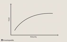
A normal yield curve is one in which longer maturity bonds have a higher yield compared to shorter-term bonds due to the risks associated with time. An inverted yield curve is one in which the shorter-term yields are higher than the longer-term yields, which can be a sign of an upcoming recession. In a flat or humped yield curve, the shorter- and longer-term yields are very close to each other, which is also a predictor of an economic transition.
A normal or up-sloped yield curve indicates yields on longer-term bonds may continue to rise, responding to periods of economic expansion. A normal yield curve thus starts with low yields for shorter-maturity bonds and then increases for bonds with longer maturity, sloping upwards. This is the most common type of yield curve as longer-maturity bonds usually have a higher yield to maturity than shorter-term bonds.
For example, assume a two-year bond offers a yield of 1%, a five-year bond offers a yield of 1.8%, a 10-year bond offers a yield of 2.5%, a 15-year bond offers a yield of 3.0%, and a 20-year bond offers a yield of 3.5%. When these points are connected on a graph, they exhibit a shape of a normal yield curve.
An inverted yield curve instead slopes downward and means that short-term interest rates exceed long-term rates. Such a yield curve corresponds to periods of economic recession, where investors expect yields on longer-maturity bonds to become even lower in the future.1 Moreover, in an economic downturn, investors seeking safe investments tend to purchase these longer-dated bonds over short-dated bonds, bidding up the price of longer bonds driving down their yield.
A flat yield curve is defined by similar yields across all maturities. A few intermediate maturities may have slightly higher yields, which causes a slight hump to appear along the flat curve. These humps are usually for the mid-term maturities, six months to two years.
As the word flat suggests, there is little difference in yield to maturity among shorter and longer-term bonds. A two-year bond could offer a yield of 6%, a five-year bond of 6.1%, a 10-year bond of 6%, and a 20-year bond of 6.05%.
Such a flat or humped yield curve implies an uncertain economic situation. It may come at the end of a high economic growth period that is leading to inflation and fears of a slowdown. It might appear at times when the central bank is expected to increase interest rates. In times of high uncertainty, investors demand similar yields across all maturities.


